Soap & Water, in detail
How a pocket front, sleeve artwork and back lettering create different readings of one Chrome Hearts design.
A pocket-front beginning
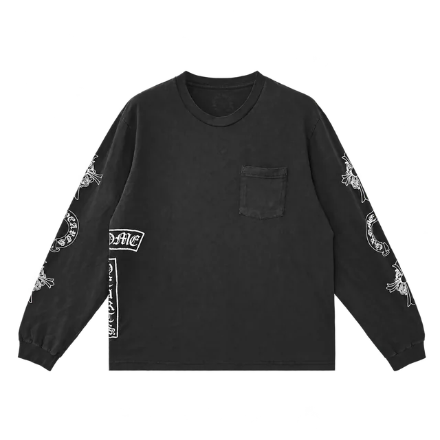
The washed-grey front establishes the piece through restraint. A chest pocket and a small signature sit within the familiar outline of a long-sleeve tee. With so much of the front left open, the contrast between the garment and its artwork becomes easier to read. The design does not need the entire graphic story in one place.
That separation is central to the piece: the pocket is an everyday garment detail, while the surrounding image system belongs to Chrome Hearts. Looking at the complete front view first makes the changes in scale along the sleeves and back more apparent.
Artwork beyond the chest
White horseshoes and floral crosses move along the sleeves. Oversized Gothic bars wrap around the side, introducing a different scale from the pocket-front signature. The long sleeves give the artwork room beyond the chest, extending the graphic arrangement through the shape of the garment.
The grey ground holds the different graphics together. What changes from one part of the garment to another is their size, orientation and placement. The appeal lies in that distribution: a complete view reveals the overall composition, while another angle can bring one emblem or line of lettering into focus.
The reverse completes the record
The back places bold lettering beneath the collar and a smaller signature near the hem. It changes the hierarchy again, concentrating attention high on the garment before returning to a smaller mark below. Ribbed neckline and cuffs frame the silhouette without competing with the artwork.
Front and back photographs are useful evidence here. A single chest image would leave out much of what distinguishes this particular long sleeve. Together, these views document the graphic arrangement from both sides, completing the record of this design.

